Description
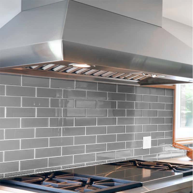
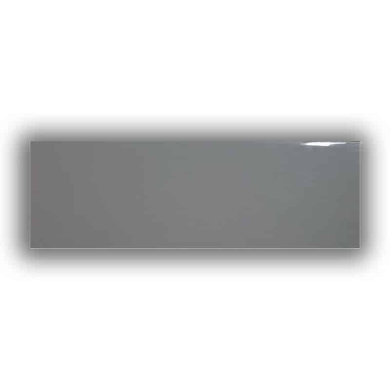
Mid Grey Gloss 300 x 100 Subway Tile brings a genuinely versatile neutral tone to any wall, splitting the difference between the starkness of white and the drama of black in a way that suits a broader range of kitchen and bathroom colour schemes than either extreme. Its classic gloss finish and rectangular subway proportion keep it flexible across laying patterns, from a traditional running bond to more contemporary herringbone or stacked layouts.
That neutral base is a genuine practical advantage when other finishes and fittings in a room are chosen separately or over time — a mid-grey wall doesn’t force a strict colour-matching exercise the way a strongly coloured tile can, and it works equally well with a bold contrasting grout or a closely matched grey grout for a more continuous look. At 32.5 tiles per square metre, coverage calculations are straightforward for planning a job.
Technical Specifications
| Size | 300mm x 100mm |
|---|---|
| Finish | Gloss |
| Shape | Rectangular |
| Coverage | 32.5 tiles per m² |
Where to Use
- Benchtop splashbacks
- Wet-area walls, bathrooms and kitchens
- Feature walls seeking a neutral, versatile backdrop
How to Apply
- Plan the layout — choose a bond pattern before starting.
- Calculate quantity — order to the nearest square metre, allowing 32.5 tiles per m² plus a wastage allowance for cuts.
- Fix with a suitable tile adhesive — select an adhesive rated for the substrate and wet-area exposure.
- Grout — choose a contrasting or matching grout colour to suit the desired finished look.
Important Notes
- Order to the nearest whole square metre, allowing extra for cuts and pattern layout.
- Confirm adhesive and grout compatibility for the specific wet-area application before installation.
Grey sits in an unusual position among wall tile colours: warm enough not to feel clinical, cool enough not to compete with warmer timber or brass fixtures, which is exactly why it gets specified so often in kitchens and bathrooms being renovated in stages over time. A tile chosen today in mid grey is far less likely to clash with tapware, cabinetry or benchtop stone selected six months later than a more strongly coloured or trend-driven tile would be, which is a genuinely practical reason to choose it beyond simple aesthetic preference.
Because grout colour has such a strong visual effect against a neutral tile, it’s worth treating the grout choice as a genuine design decision rather than a default white or grey. A darker grout against mid grey tile creates a subtle, tonal pattern that reads as texture rather than contrast, while a lighter grout keeps the wall feeling more uniform and calm — both are legitimate directions, and the right one depends on whether the wall is meant to be a quiet backdrop or a subtle feature in its own right.